Argentum will be launching its new website and logo later this month. In the interim, I thought it’d be fun to give a sneak peek at our new logo and the logic behind it.
My hypothesis has always been that the Argentum Strategy Group logo was derived from the atomic structure of silver. There are a few reasons I suspect this:
1. The founder’s last name is Silver
2. Argentum is Latin for silver
3. The designers at Logoworks.com (now an HP company) did not have much to go on when they created the first logo back in 2006. When you basically sell your brain the associated imagery can be a little challenging.
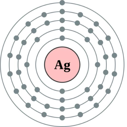
Here’s the atomic structure of silver:
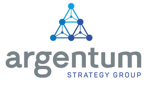
And here’s the original Argentum logo:
![]()
This logo has served me well for 9 1/2 years. But when two colleagues who I greatly respect independently (and gently) implied that perhaps it was time for a new logo, well, I took the hint!
I decided to partner with Stacy Karzen, a graphic designer whose work and strategic exploration process I love. Better still, we’ve worked together consulting to the same client, so she has a deep firsthand understanding of how I help my clients.
After our briefing conversation, Stacy started by exploring ways to put a new spin on silver’s atomic structure. She also knew that I love the color blue and round logos (we all have our weaknesses).
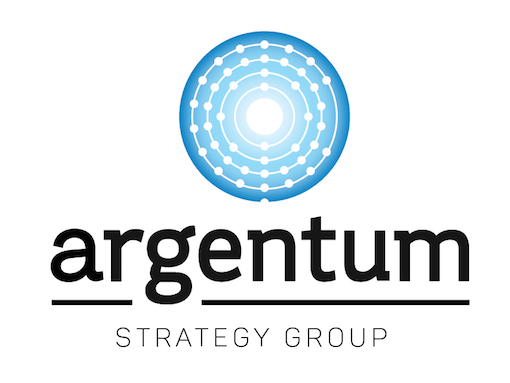
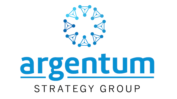
Her exploration evolved from there to include silver’s molecular structure:
Stacy liked the way the pyramid shape worked, so she iterated.
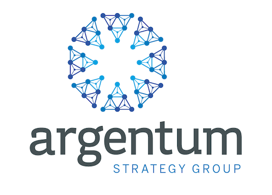
I think the middle pyramid iteration is so beautiful, and it was initially my favorite. But after thinking about it, I decided that it was too complex to accurately represent how Argentum helps clients. We’re all about helping simplify things and this logo made our company look complicated.
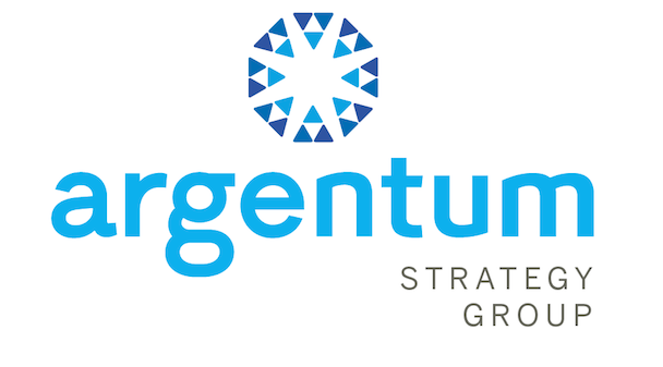
The first, simpler, iteration is a much better metaphor for how Argentum works with clients. I love that the disparate elements are all focused and pointing in the same direction.
So I asked Stacy to iterate on that version for the next round. She explored fonts, name color and font, and different “lockup” styles.
After a lot of tweaking, back and forth and discussion of fonts, which was completely alien to me, this is where we netted out.
Here’s the new Argentum logo – TA DA!